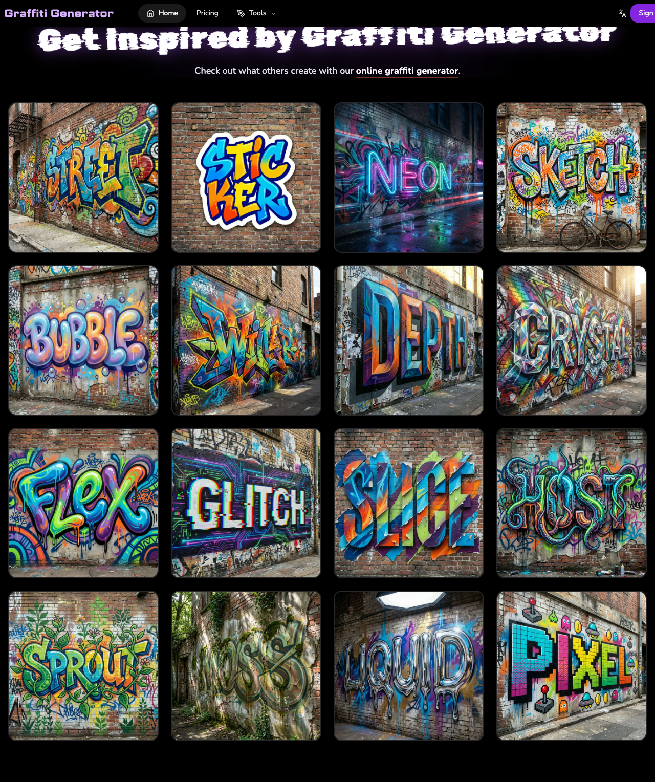
A lot of people use the words graffiti tag and graffiti font as if they mean the same thing. They do not.
If you are making a short alias, a personal signature, or something that should feel quick and direct, you are usually looking for a graffiti tag.
If you are making a readable word, logo text, title graphic, or creator-facing visual, you are usually looking for a graffiti font or a graffiti lettering workflow.
That difference matters because the right tool changes depending on the job.
Quick Answer
A graffiti tag is usually shorter, more signature-like, and more personal. A graffiti font is usually more structured, more readable, and more useful for longer words, titles, logo text, and wordmarks.
If your goal is a short alias, initials, gamer tag, or artist signature, use a tag-style workflow.
If your goal is readable graffiti text for a logo, cover image, profile graphic, or title, use a font-style workflow.
What Is a Graffiti Tag?
A graffiti tag is the most basic personal signature in graffiti culture. It is usually:
- short
- fast
- personal
- identity-driven
- less concerned with perfect readability than with style and recognition
A tag often works best when it feels like a direct mark rather than a polished design system. That is why tags are commonly built from:
- nicknames
- aliases
- initials
- short artist names
- gamer names
In digital tools, a graffiti tag generator is usually best for those short identity-style use cases.
What Is a Graffiti Font?
A graffiti font is a more structured lettering approach. It is still stylized, but it is usually more readable and more suitable for longer text.
A graffiti font workflow is better when you need:
- a readable title
- logo text
- wordmarks
- creator branding
- social media cover text
- text that still needs to be understood quickly
This does not mean a graffiti font has to look clean or boring. It just means the text is doing a different job from a tag.
The Main Difference in One Table
| Question | Graffiti Tag | Graffiti Font |
|---|---|---|
| Best for | Aliases, initials, signatures | Readable words, titles, logo text |
| Text length | Usually short | Can handle longer text better |
| Feel | Personal, fast, direct | Structured, stylized, more legible |
| Use cases | Gamer tags, artist marks, profile identity | Headers, thumbnails, wordmarks, creator branding |
| Better tool path | Graffiti Tag Generator | Graffiti Font Generator |
When You Should Use a Graffiti Tag
Use a graffiti tag when the text should feel like a personal mark.
Good examples:
- a gamer alias
- an artist nickname
- initials for a profile image
- a short creator signature
- a compact sticker-style mark
In these cases, the goal is not maximum readability. The goal is style, identity, and memorability.
If that sounds like your task, a dedicated tag tool is usually the best fit:
When You Should Use a Graffiti Font
Use a graffiti font when the text still has to read clearly.
Good examples:
- YouTube thumbnail text
- logo text
- wordmark exploration
- title graphics
- creator brand headers
- social media visual text
In these cases, the text is not just a signature. It is part of communication. People need to read it quickly.
If that sounds like your task, a more lettering-focused workflow is usually better:
Why People Get This Wrong
The confusion happens because both tags and graffiti fonts can look "graffiti-style." But visual style and functional job are not the same thing.
Two designs can both look urban, bold, and spray-inspired, while solving different problems:
- one is an identity mark
- one is readable text design
This is why a single broad "graffiti generator" page often creates confusion. The better approach is to separate the use cases.
A Simple Rule for Choosing
Use this quick rule:
Choose a tag workflow if:
- the text is short
- the result should feel personal
- the output is more like a signature than a title
Choose a font workflow if:
- the text needs to be readable
- the word is longer
- the output is meant for a logo, title, or creator graphic
If you want a broader browser-based entry point before choosing either path, you can also start here:
Common Mistakes
1. Using a tag for long text
A tag usually loses strength when the input gets too long.
2. Using a font workflow for a signature-style alias
If the goal is speed and identity, structured lettering can feel too formal.
3. Choosing based only on style names
Do not choose the tool only because a style looks cool. Choose it based on what the text needs to do.
Final Recommendation
If your text is short and identity-driven, start with a tag generator.
If your text needs stronger readability for branding or content, start with a graffiti font generator.
That is the practical difference between a graffiti tag and a graffiti font: they may share a visual culture, but they solve different jobs.